
MATILDA SYKES reviews Naturally Brilliant Colour at Kew Gardens, an exhibition that demonstrates the dazzling visual power of Pure Structural Colour and celebrates its ability to replicate the natural world in art.
Naturally Brilliant Colour is a small yet exquisite exhibition. Kew’s claim to display ‘the boldest, brightest colour on Earth’ is a hefty one to say the least – but it’s certainly justified. The exhibition revolves around the recent artificial creation of ‘Pure Structural Colour’ and the ways it has since been used in art, design and technology. But what exactly is Pure Structural Colour? As described by the exhibition, certain animals and plants possess microscopic structures in their surface layers, which generate bright colours when reflecting sunlight. Think, for instance, the colours of butterfly wings or the feathers of hummingbirds. For the first time in history, scientists have managed to reproduce this phenomenon artificially, its uses in art manifold and boundlessly captivating.
Upon arrival at the Gardens and after ambling down Camellia Walk to the Shirley Sherwood Gallery (which in May is pretty naturally brilliant itself), you reach a small building that houses some of the most absorbing, ‘jewel-like’ shades of colour ever created outside of nature. If you need them, bring your glasses – there’s a lot to learn along the way.
The exhibition starts with a thorough scientific explanation of the evolution of vision and colour. The information is accompanied by Abstract Expressionist paintings by artist, scientist and author Andrew Parker. These large paintings, composed of exuberant primary colours, have a meticulous technicality to them, drawing attention to both the artistic and scientific focus of the exhibition. Ultimately, Naturally Brilliant Colour is a scientific breakthrough applied to artistic practice; to fully enjoy the exhibition, you need to read the small print.

As you move through the gallery space, the different types of colour in nature are elucidated: pigmented bodies, structural coloured bodies, bioluminescent bodies and fluorescent bodies. This is the most information-dense section of the exhibition, yet is made digestible through Parker’s polyptych display, demonstrating the colours’ different properties and in turn illuminating the text. Parker uses acrylic, for example, to reflect pigmented colour’s relative aesthetic flatness: a simple gesture but oddly helpful for scientific comprehension.
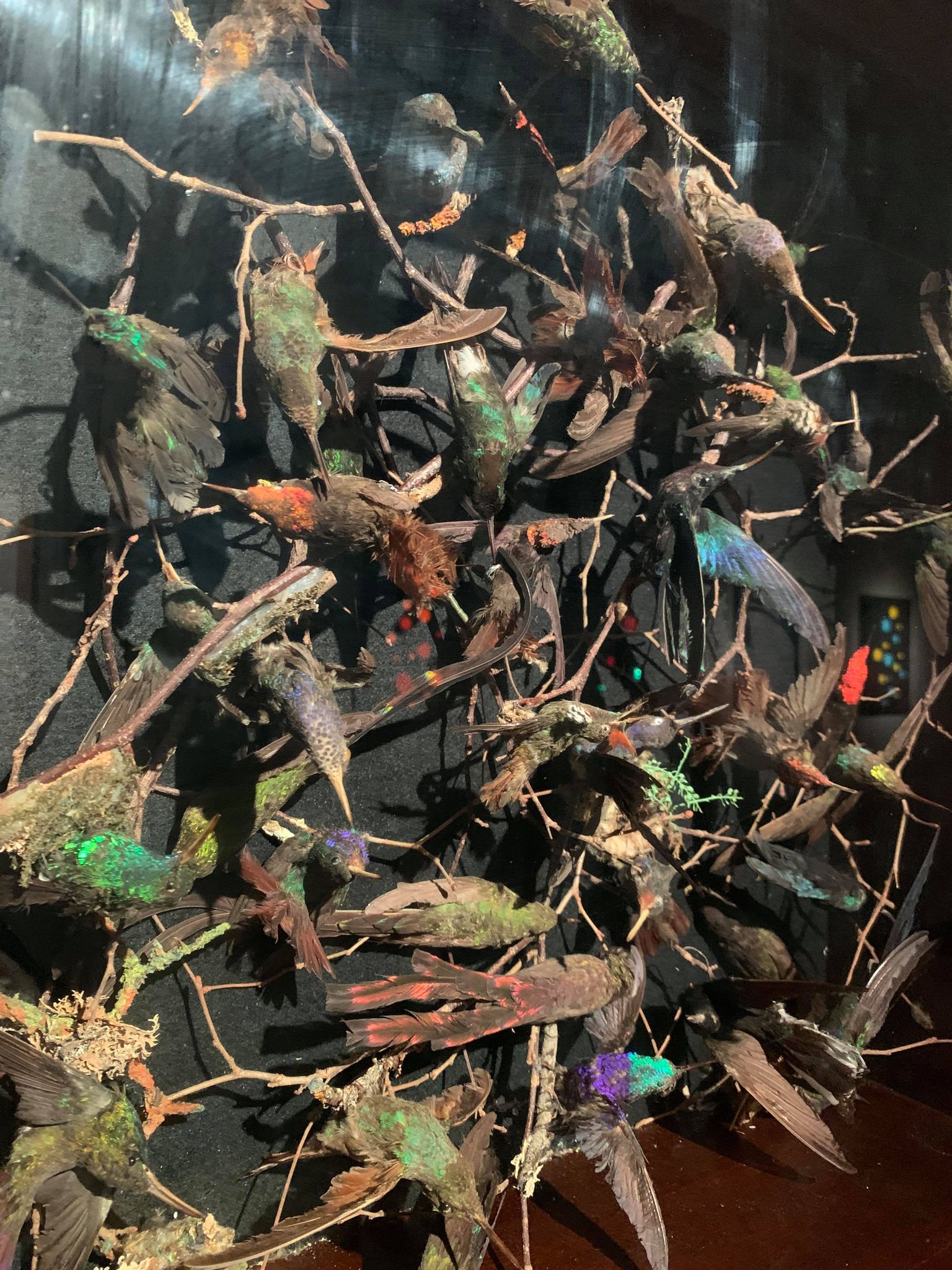
The human endeavour to reproduce nature’s structural colour is then mapped out through a focus on artistic renderings of hummingbirds over the years. On display are artworks by the nineteenth-century ornithologist and artist John Gould. These works show Gould’s continued attempts to capture the iridescence found in nature through complex three-stage artistic processes: ‘depositing a base layer of gold or silver leaf, adding a layer of translucent paint, and finishing with a ‘secret’ glaze containing honey’. The laborious process results in an unusual degree of pictorial vivacity. Yet, as the exhibition makes clear, Gould’s renderings still fall short of truly mirroring the iridescent quality of fish, birds and plants. Such limitations of pictorial representation are emphasised in one of the most impressive pieces in the whole exhibition, a glass case containing an explosion of taxidermy hummingbirds. Positioned as if darting and flitting, suspended in flight, the myriad colours and markings of these creatures both clash and chime in odd harmony with one another. The viewer receives an amazing demonstration of what exactly Pure Structural Colour hopes to artificially recreate – the iridescent, metallic, scintillating sheen of these creatures.

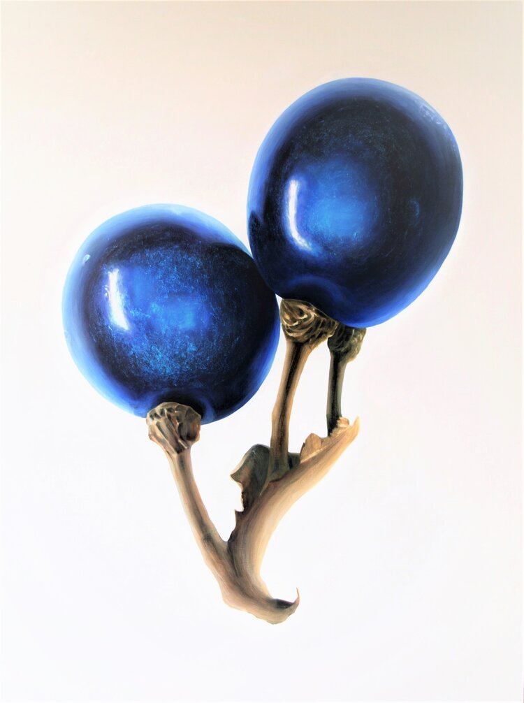
As we move through the gallery, an enormous blue painting looms in our peripheral vision; hanging at the end of the hallway is Pollia Condensata (2019) by Coral G Guest. This painting depicts Pollia, a plant native to Africa, chosen by Guest for being ‘the most intense blue in the whole of the natural and biological world’. Guest’s painting, which uses flakes of Pure Structural Colour mixed with acrylic, takes a moment to comprehend. The blue orbs of the huge berries simultaneously appear to recede and advance, as though countervailing forces are at play, pushing and pulling the eye into and out of the painting. This is a direct effect of using flakes of Pure Structural Colour, known to possess multidirectional properties and ‘near-optimal reflectivity’. The effect is mesmerising. Eventually, the magnified spherical forms depicted appear more like planets; this cosmic quality is emphasised by Guest’s sometimes scratchy application of paint, which create vein-like marks on the surface of the work, reminiscent of the sinewy networks of stars in nebulas. Refocus your gaze once more, however, and they are berries again.
The middle of the exhibition offers two short explanatory videos from Andrew Parker and Coral G Guest, in which they briefly refresh the information the viewer has just been reading on the various plaques – the refresher is very welcome. There is also a large, kaleidoscopic projection of nature’s colours, in which each pigment is either coloured with Pure Structural Colour or conventional pigments, to highlight the difference in intensity. The final room, however, is the exhibit’s tour de force, in which an abundance of Pure Structural Colour artworks and design pieces bespeak the real brilliance of the invention. Ranging from dynamic wall installations to sunglasses, to the world’s first Pure Structural Colour Nike Air Jordan III’s (probably beyond the economic reach of even the most tenacious of trainer collectors), the malleability of this new type of colour is evident.
Seven Discs (2018) by Andrew Parker is particularly effective at conveying Pure Structural Colour’s aesthetic power. The simple composition of large fields of colour allows the eye to bask in these uninterrupted hues. The elevated position of the discs depicted, situated just above the eye-line, instils a sense of reverence in the viewer as they gaze up from below. The discs are contradictory; simultaneously satin and velvet in texture; at once cheerful and solemn; steady but also shifting. The discs possess a mystical feel – at times, they are so bright they appear to palpitate. As you walk past, their hues shift slightly, some more than others – I noted myself swaying from foot to foot in an attempt to activate this rippling of colour. The effect is due to the additional brightness of the colour that targets shortcomings in our visual system and generates the effect of movement – as Parker observed, ‘we think we are seeing something we are not’ .
The exhibition closes with an emphasis on bio-inspiration. Pure Structural Colour could be used as an alternative to some pigments found in our paints and colourants to offer a reduced environmental footprint, but at the moment it is too expensive to be used commercially. The exhibition also seems to suggest that the bio-inspired approach could improve health and well-being. Parker writes that ‘we perceive and enjoy the types of colours we find in nature because of the long evolution of our ancestors. The bright colours in nature became a stimulus to boost our morale, perhaps to help early humans to get through difficult times, such as an ice age’. Dare I draw the comparison?
Wonderfully, the exhibition continues beyond the gallery. A five-minute walk to the Temperate House presents you with some of the exact plants referenced in the exhibition, such as the Queen Flower, faithfully represented by botanical artist Robert John Thornton’s in his 1800 aquatint engraving. The exhibition – which is as educative as it is vivid – attunes you to the various kinds of pigmentation present in the natural world, which can then be seen in the iconic Temperate House itself.

It’s tantalising to imagine how artists such as Turner, Rothko or O’Keeffe might have used Pure Structural Colour in their artworks – how enormously impactful the results might have been. It is hoped that the bio-inspired substance could have a significant impact on commercial, scientific and artistic practice some day soon. But, until then, the exhibition is open until the 26th September 2021, where visitors can see the first public showing of Pure Structural Colour ever – and indeed have a nice peruse of Kew.
Naturally Brilliant Colour will be on display at Kew Gardens from Monday 17th May – Sunday 26th September 2021. The accompanying book Naturally Brilliant Colour by Andrew Parker is available to buy here.
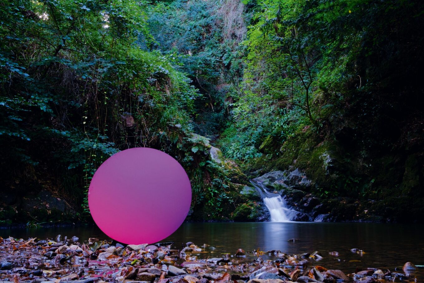
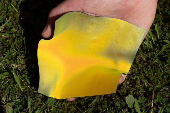
Featured image: 50cm Pure Structural Colour discs in Shropshire; arrangement by Andrew Parker, photography by Ben Osbourne, 2019. Digital Photograph. Lifescaped Art Collection. Image source: Lifescaped.